By the VixQR team · published on · 10 min read
QR Code Accessibility: The WCAG and ADA Rules Nobody Documents
QR codes aren't banned by WCAG or the ADA — but using one as the only way in fails both. Contrast, alt text, placement and the fixes that take an hour.
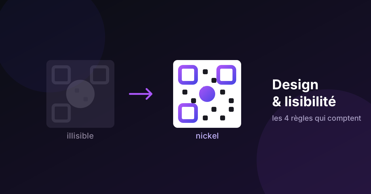
A QR code is an image that you have to see, find, aim a camera at, and hold steady. Every one of those verbs is a barrier for somebody.
That doesn't make QR codes inaccessible. It makes them inaccessible when they're the only way in — which, unfortunately, is how most organisations deploy them. Restaurant menus. Transit signage. Healthcare intake forms. Museum labels. Replace the printed thing entirely with a square, and you've locked out a share of your audience.
None of the fixes are technically hard. Almost none of them are documented anywhere useful. Here's the whole picture.
What the rules actually say
Neither WCAG nor the ADA bans QR codes. What they require is equivalent access — that a person who can't use the QR code can still get the information.
The specific criteria that apply:
WCAG 1.1.1 (Non-text Content) — any QR code image in digital content needs a text alternative describing its purpose. "QR code" fails. The destination is the content; the code is just delivery.
WCAG 1.3.1 (Info and Relationships) — information conveyed visually must be available programmatically or as text. A QR code alone on a page, with no URL and no text equivalent, means that information is unavailable to anyone who can't scan.
WCAG 1.4.11 (Non-text Contrast) — graphical objects need a minimum 3:1 contrast ratio. QR modules are graphical objects that must be distinguishable for the design to function at all.
WCAG 2.4.4 (Link Purpose) — applies whenever the code functions as a link.
WCAG 2.2's 3.3.8 (Accessible Authentication) — applies if scanning leads into a login flow.
ADA Title III requires "full and equal enjoyment" of goods and services at places of public accommodation. If a restaurant removes printed menus entirely and offers only a QR code, a blind customer has no equivalent access. That's the failure — not the QR code's existence.
Section 508 covers US federal agencies and treats QR codes as ICT when used as electronic content: an image needing alt text, and a link needing a keyboard-reachable equivalent.
Note what's not covered: Section 508 standards don't apply to print. Which is exactly where most QR codes live. Print accessibility is governed by the ADA's equivalency principle rather than a technical checklist — meaning there's no box to tick, just an outcome to achieve.
Who this affects, concretely
Roughly 253 million people worldwide live with moderate-to-severe visual impairment (WHO, 2023). But the affected group is much wider than that:
- Low vision — can't locate a small code on a busy poster, or can't resolve it well enough to aim.
- Blind users — a screen reader cannot scan a QR code. That's a physical constraint, not a software gap.
- Motor impairments and tremor — framing a small square with a handheld camera is a fine-motor task. Essential tremor turns a one-second scan into a three-attempt struggle.
- Wheelchair users — a code at eye height for a standing adult is unreachable and unaimable from a seated position.
- Cognitive differences — "scan me" assumes the reader knows what that means and what will happen next.
- Older or budget phones — smaller sensors, worse low-light performance. These fail first, and they correlate with lower income.
- People who simply don't trust QR codes — after years of phishing coverage, plenty of people won't scan a code on principle. They're not wrong to hesitate.
The two fixes that solve most of it
If you do nothing else, do these. Together they take under an hour and resolve the majority of real failures.
1. Print the destination URL next to the code
This is the single highest-leverage change in the entire field, and it's free.
A short, typed URL beside the code recovers everyone whose camera is broken or restricted, who can't aim, who's using a screen reader on a different device, who wants to open it on a desktop, or who doesn't trust the code. It also removes the exclusive-access barrier that WCAG 1.3.1 and the ADA both target.
For the fallback to be real, the URL has to be typeable. yourbrand.com/menu works. A 60-character tracking URL with UTM parameters does not — nobody is typing that, and offering it is a box-tick rather than a solution. If you need tracking, put it in a server-side redirect behind a clean path.
There's a security bonus too. The most common QR attack is a sticker placed over a legitimate code. A guest who can see that the printed URL doesn't match the visible address will hesitate before scanning. The accessibility fix is also the anti-fraud fix.
2. Write alt text that names the destination
In any digital context — a web page, a PDF, an email, a ticket — the QR code image needs alt text describing where it goes and what happens.
The pattern:
alt="QR code — scan to view the menu at example.com/menu"
Not alt="QR code". Not alt="black and white square pattern". The user needs the destination, not a description of the artwork.
And pair the image with a real link. A screen reader user doesn't want the image at all; they want the destination. Render the URL as an actual anchor with descriptive link text near the code. The QR is a convenience for the in-person sighted user; the anchor serves everyone else.
For codes you generate client-side as inline SVG, set role="img" and an aria-label on the SVG element — otherwise a screen reader may announce hundreds of individual <rect> elements as separate graphics.
Contrast: where branded codes quietly fail
This is the part we have direct experience with, because we built a contrast check into the VixQR generator and then watched what it caught.
Standard black-on-white is around 21:1. Enormously above any threshold. You cannot fail with it.
The failures come from brand colours. When we added custom foreground colours — and later a second colour for the eyes, and a two-tone speckle mode — we routed every colour the user picks through the same scannability check, taking the worst contrast among them. The warning fires on its own for combinations that look completely fine on a designer's calibrated monitor:
- Mid-grey on cream. Looks elegant. Lands around 4:1. Borderline.
- Navy on charcoal. Reads as "dark on dark" to a camera. Fails.
- Red on green. High contrast to a typical viewer, nearly invisible to someone with deuteranopia or protanopia — around one in twelve men has some form of red-green colour blindness. The fix is to build contrast on the lightness axis, not the hue axis. If the modules and background share a luminance, no colour filter or assistive lens recovers them.
- Light modules on a dark background. Inverted codes do scan when contrast is high enough, but many older scanner apps and assistive camera modes assume dark-on-light. Safer default: dark modules, light background.
Where to set the bar. WCAG 1.4.11's floor for graphical objects is 3:1. The QR standard (ISO/IEC 18004) works to a print contrast signal of roughly 4:1. The two don't perfectly agree, and neither accounts for a five-year-old phone in a dim restaurant. Our working rule: treat 4.5:1 as the operating point, not 3:1. The extra margin costs you nothing visually and buys back the users at the edge.
Physical placement
Digital accessibility guidance is everywhere. Physical placement guidance is almost nonexistent, and it's where printed codes actually fail.
Height. The US ADA Standards for Accessible Design specify a forward-approach reach range of roughly 38 to 122 cm (15–48 in) above the floor. For QR codes, target the centre of the code at 100–120 cm. That works for a seated user, a standing adult, and a child.
Don't place codes above about 140 cm on a vertical surface — a wheelchair user can't reach up to aim, and a tall person aiming downward usually catches glare from overhead lighting. Don't place codes that require leaning over a counter, either. Put them on the front face of the counter, not the horizontal top.
Size. Below roughly 2 × 2 cm, scan reliability collapses for anyone with a tremor or an older camera. Our size and scan distance guide has the full chart, but for accessibility specifically: go one step larger than the minimum. A bigger target is easier to frame, and it's the cheapest accommodation available.
Lighting and glare. Codes behind glass, on glossy laminate, or in dim corners are hardest for exactly the users who already struggle. Matte surfaces, even lighting, no glass if avoidable.
Label the action. "Scan or visit example.com/menu for the full menu" tells a cognitively diverse user, a first-time scanner, and a screen reader user the same thing. "Scan me" tells nobody anything.
Consider an NFC tag alongside. NFC reads at one to four centimetres with no aiming, no framing and no light. For a user with low vision or limited fine motor control, hovering a phone near a surface removes the hardest part of the interaction entirely. It's not a replacement — plenty of phones and users won't use it — but as a parallel path it's genuinely inclusive.
Screen-based QR codes have their own failure modes
When a QR code appears on a screen — a login flow, a boarding pass, a confirmation page — a different set of problems appears, and they're rarely tested:
The code gets cut off. Screen reader users often work in small browser windows, because they don't need the window sized for visual reading. Users with low vision browse at 200% zoom or more. Both crop the QR code without the user knowing. Fix: make the code sticky so it can't scroll out of view, and let users open it fullscreen by clicking or pressing Enter or Space.
The mouse pointer covers it. A large custom cursor parked over the code blocks it. Hide the pointer after three seconds of no movement, the way video players do.
The time limit is too short. Login QR codes often expire in 30 seconds. Following instructions with a screen reader takes considerably longer than reading them visually — and the same is true for many users with dyslexia or ADHD. WCAG requires that users can extend a time limit to at least ten times the default and be warned before it expires. Practically: allow 3–5 minutes, warn at 30 seconds remaining, and make extending it a single keypress.
The screen curtain is on. Many blind users browse with the screen off entirely. If your flow requires scanning a code with a second device, say so — in visually hidden text aimed at screen reader users, under its own heading so it's easy to navigate to.
The failure that wastes all the other work
A blind user follows your carefully provided alternative URL. The destination page is an image of a menu. Their screen reader announces nothing.
Every accessibility decision upstream is now worthless.
The destination has to be accessible independently. Real text, not a picture of text. Not a PDF scan. WCAG 2.1 AA on the landing page. And if the destination is only available in one language while your signage is in another, you've excluded people at the last step.
The QR code is never the whole journey. It's one link in it, and the chain is only as accessible as its weakest part.
The checklist
- Destination URL printed beside every physical code, short enough to type
- Alt text naming the destination on every digital instance
- A real anchor link paired with every on-screen code
- Contrast at 4.5:1 or better, built on lightness rather than hue
- Dark modules on a light background, not inverted
- Code centre at 100–120 cm on vertical surfaces
- One size larger than the technical minimum
- Human-readable label saying what scanning does
- Sticky and fullscreen-able for on-screen codes
- Time limits of 3–5 minutes, extendable, with warning
- Destination page passing WCAG 2.1 AA on its own
- Tested with VoiceOver and TalkBack, on an older phone, in the real lighting
Automated checkers catch almost none of this. The honest test isn't whether the code scans for you on a new phone at your desk. It's whether it works for the user with low vision holding their phone five centimetres from the surface, the user framing it on the third attempt, and the user in a wheelchair reaching up at 130 cm.
Design for them and everyone else benefits too — which is, as usual, how accessibility tends to work.
VixQR generates QR codes free in your browser and warns you when your colour choices drop below a reliable contrast ratio, before you commit them to print. SVG and PDF export, no account required.