By the VixQR team · published on · 10 min read
How to Add a Logo to a QR Code Without Breaking It
QR codes tolerate up to 30% damage thanks to error correction. How it works, how big a logo can safely be, and the one area you must never cover.
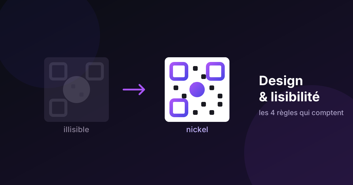
Putting a logo in the middle of a QR code shouldn't work. You're deleting part of the data and expecting the scanner to read it anyway.
It works because of a feature built into the QR standard from the start — and understanding that feature tells you exactly how far you can push a design before it stops scanning.
Why you can cover part of a QR code at all
The QR specification (ISO/IEC 18004) includes Reed-Solomon error correction: the encoded data is stored redundantly, so a scanner can reconstruct the original content even when part of the pattern is missing, dirty, or obscured.
There are four levels, and you choose one when you generate the code:
| Level | Recoverable damage | Typical use |
|---|---|---|
| L (Low) | up to 7% | Clean digital display, maximum data capacity |
| M (Medium) | up to 15% | General-purpose default |
| Q (Quartile) | up to 25% | Print, industrial environments |
| H (High) | up to 30% | Logos, harsh conditions, outdoor use |
At level H, you can obscure up to 30% of the code's surface — with a scratch, a coffee stain, or a logo — and it still reads.
That redundancy isn't free. Higher correction means more of the grid is spent on recovery data rather than content, so the pattern gets denser at the same printed size. Use H when you're adding a logo; don't use it reflexively for everything.
The one area you must never cover
The three large nested squares in three corners are the finder patterns. They exist so a scanner can locate the code, work out its orientation, and correct for the angle you're holding the phone at. They're the reason a QR code reads upside down, rotated, or viewed from the side.
Error correction does not protect them. Cover a finder pattern and the camera doesn't recover the data — it doesn't recognise there's a QR code there at all.
The same caution applies to the smaller square near the bottom-right corner on medium and large codes. That's an alignment pattern, used to correct perspective distortion when the code is photographed at an angle or printed on a curved surface. Larger codes carry several of them distributed through the grid.
Rule: the centre is negotiable, the corners are not. Every creative QR design that fails does so because someone decided the corner squares looked untidy.
How big can the logo be?
The theoretical ceiling at level H is 30% of the surface. The practical ceiling is lower — aim for no more than 20–25%, and less if the logo is complex.
Two reasons for the margin. First, that 30% budget is shared with everything else that degrades the code: print imperfection, dirt, glare, creasing, a camera that can't quite focus. Spend it all on the logo and there's nothing left for the real world. Second, error correction assumes damage is distributed. A single solid block in the centre is the worst case for the algorithm, not the average one.
Practical guidance:
- Keep the logo centred. The middle of the grid is where obscuring hurts least.
- Prefer simple shapes. A flat mark with strong edges survives better than a gradient-heavy logo with fine detail — which will also look muddy at 2 cm on a business card.
- Put a small quiet margin around the logo. A few modules of clear background between your mark and the surrounding pattern helps the scanner separate the two.
- Shorten what you encode. A short URL produces a sparse pattern with larger modules, which tolerates a logo far better than a dense vCard. This is the single most effective lever and the one people skip.
Colour: contrast is what matters, not hue
You can absolutely use brand colours. What you cannot do is ignore contrast.
A camera analysing a QR code works primarily on luminance — perceived lightness — not hue. Two colours can look strikingly different to the human eye while sitting at nearly identical luminance, which makes the code unreadable in low light or on a cheaper sensor.
Combinations that work:
- A dark colour on white or near-white: navy, forest green, burgundy, dark brown
- A gradient between two dark tones — navy to deep purple stays readable throughout
- A very light background (soft beige, pale grey) with very dark modules
Combinations to avoid:
- Vivid colours of similar luminance: bright red on bright green, orange on light blue
- Pale or pastel modules on white — visually distinct, insufficiently contrasted for a scanner
- Two mid-saturation colours where neither is clearly darker
- Inverted codes (light modules on a dark background). Some generators allow it, but many scanners are optimised for dark-on-light, and inversion is the least reliably tested configuration across phone models
The quick test: convert both colours to greyscale. If the two greys look similar, the contrast is insufficient — no matter how different the original colours appear.
Backgrounds and gradients
Placing a QR code over a photograph or texture is risky: local contrast varies across the image, so some modules read cleanly while others fail. If you want an illustrated background, keep a solid, light area directly behind the code itself. Even a small margin of flat colour makes a large difference.
Gradients applied to the modules generally work, provided the gradient stays within a dark range from start to finish. A gradient that begins dark and ends light creates a zone of insufficient contrast at one specific part of the code — often invisible on screen, and reliably fatal to the scan in exactly that spot.
Rounded modules and custom shapes
Most generators let you round the module corners or swap in dot shapes. This is usually safe in moderation, because the scanner samples the centre of each module cell rather than reading its outline.
Push it too far — heavy rounding, large gaps between modules, decorative shapes that shrink the filled area — and you erode the effective contrast of every cell at once. Combined with a logo and a coloured palette, three individually-acceptable choices stack into a code that fails.
Change one variable at a time and test between each.
What level H actually costs you
Error correction isn't free capacity — it's capacity you spend on redundancy instead of content. Understanding the trade explains why some logo attempts fail for reasons that look unrelated.
A QR code's grid size is set by its version, from version 1 (21×21 modules) to version 40 (177×177). Your generator picks the smallest version that can hold your content at the correction level you chose. Raise the level and you may push the content into a larger version — more modules in the same printed square, so each module is physically smaller.
Roughly, for a plain URL:
| Content | At level L | At level H |
|---|---|---|
| ~25-character short URL | Version 1–2 (21–25 modules) | Version 2–3 (25–29 modules) |
| ~60-character URL | Version 3 (29 modules) | Version 5 (37 modules) |
| ~150-character URL with tracking | Version 6 (41 modules) | Version 9–10 (53–57 modules) |
| Full vCard | Version 10+ | Version 15+ (77+ modules) |
Read the bottom row carefully. A full vCard at level H can approach 77 modules across. On a 2 cm business card code, that's a module width of about 0.26 mm — below what most phone cameras resolve reliably at arm's length, before you've added a logo at all.
This is the trap behind the most common failure: someone sets H because they're adding a logo, encodes a long URL or a fat vCard, prints small, and concludes that logos break QR codes. The logo wasn't the problem. The combination of long content, high correction and small print was.
The lever is always the same: shorten what you encode. Cutting a 150-character URL to a 25-character one can move you from version 9 down to version 2 — roughly doubling every module's physical size at the same printed dimensions. That single change buys more scanning reliability than every design tweak in this article combined.
Which logos survive, and which don't
Not all marks behave the same way in the middle of a code.
Survive well:
- A solid shape on a filled plate — circle, rounded square, or the logo sitting on a white disc. The obscured region is clean and contiguous, which is what the decoder copes with best.
- Bold, high-contrast marks. A single-colour wordmark or icon at reasonable weight.
- Simple geometry. Letters, basic shapes, thick strokes.
Cause trouble:
- Intricate cutouts. A logo knocked out along a complex silhouette leaves slivers of code pattern visible between its limbs. Those fragments are neither cleanly present nor cleanly absent, and they confuse module sampling more than a solid block would.
- Thin lines and fine detail. They disappear at 2 cm anyway, so you're damaging the code for a mark nobody can see.
- Gradients and soft edges. A logo that fades into the code has no clear boundary, and the transition zone is ambiguous to a sampler.
- Transparent backgrounds over the pattern. The code shows through at partial opacity, producing mid-grey modules — the exact condition a binary decoder can't resolve.
The counter-intuitive rule: a solid opaque logo damages the code less than a delicate transparent one, even when it covers more area. Clean damage is recoverable. Ambiguous damage is not.
Where to put the logo if not the centre
Almost everyone centres it, and the centre is indeed the safest single location. But it isn't the only one.
The area immediately below the code, outside the quiet zone, costs you nothing at all — zero error-correction budget, zero risk, and at small print sizes a logo down there is more legible than the same mark squeezed into the middle of a 2 cm pattern.
The fourth corner — bottom-right, the one without a finder pattern — is sometimes proposed as a logo position. Don't. On anything larger than a version 1 code, that region carries alignment patterns, and covering them destroys the perspective correction that makes off-angle scanning work.
If brand presence is the actual goal rather than decoration, a logo beside the code with a short label usually achieves more than one buried inside it — and it leaves your entire correction budget available for print and handling.
Frames and "scan me" labels
Worth mentioning because it's the highest-return design element and it's usually treated as an afterthought.
Adding a frame with a short instruction — "Scan for the menu", "Scan to join our WiFi" — reliably increases how often codes get scanned, for the unglamorous reason that it tells people what they'll get. An unlabelled square asks for a leap of faith; a labelled one makes an offer.
Two constraints:
The frame must not intrude on the quiet zone. The four-module clear margin has to survive inside the frame. Most generators handle this; if you build the frame yourself in a design tool, check it.
Text goes below or beside, never over. Anything overlapping the pattern spends error-correction budget you've already allocated to the logo.
And label the outcome, not the action. "Scan me" says nothing. "Scan for allergen information" is a reason.
The checklist
- Set error correction to H before adding a logo
- Keep the logo under 20–25% of the surface, centred, with a small clear margin
- Never touch the three corner finder patterns, or the alignment pattern near the bottom-right
- Shorten the encoded content so the pattern stays sparse
- Check contrast in greyscale, not in colour
- Preserve the quiet zone — at least four modules of clear space around the whole code
- Print it and scan it with two or three phones, including an older Android, before any print run
That last step is not optional. A code that scans instantly on the newest iPhone under office lighting can fail on a three-year-old Android in a dim restaurant — and the phones that fail first are the ones your customers are most likely to be holding.
You can build a branded code — logo, colours, module shapes, error correction level — with VixQR. It flags insufficient contrast and oversized logos while you design, generates everything in your browser, and exports SVG for print. Free, no account, and the codes are static, so they never expire.