By the VixQR team · published on · 9 min read
Why My First QR Codes Were Terrible (and How I Learned to Customise Them)
Logo too big, contrast ruined, quiet zone forgotten: every QR design mistake I made building VixQR, and the rules that stopped me repeating them.
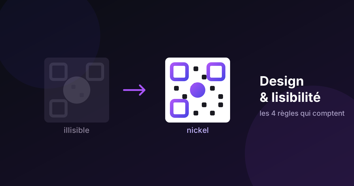
My very first custom QR code was a disaster.
Not "meh". Not "could be better". A disaster.
I'd given it a pink-to-orange gradient because it looked great. I'd dropped a nice big logo in the middle, because otherwise what's the point. And a light grey background, very tasteful. On my screen the result was honestly rather handsome.
It didn't scan. At all. No phone. Ever.
It took me a solid hour to work out that I hadn't made a QR code. I'd made an attractive decorative square. That hour, spent turning the problem over from every angle, is what eventually became the scannability checker built into VixQR. Every warning it shows today is one of my mistakes, converted into a guardrail.
So I may as well hand them over. It'll save you the hour I lost.
The starting misunderstanding: a QR code isn't a picture
Here's what I hadn't grasped.
When you look at a QR code, you see a pattern. Your phone sees a grid of cells that it has to sort into two categories: dark or light. That's it. No nuance, no interpretation, no "well, that one leans a bit dark, let's call it dark".
It's binary. Brutally binary.
My light grey background and pale pink? To the camera, two greys that looked far too similar. It no longer knew what belonged where. So it gave up.
The right way to think about it is the photocopier test. Imagine photocopying your code in black and white, on an old machine, on a Monday morning. If the pattern stays clearly darker than the background, you're fine. If it dissolves into the background, your code is dead — however lovely it looks in colour.
That mental test has saved me more mistakes than any tool.
Mistake 1: the logo that ate the code
I made this one with total confidence.
QR codes include error correction: part of the information is duplicated across the pattern so the code stays readable even when damaged. Scratched, folded, stained with coffee — it still works. It's genuinely brilliant engineering.
There are four levels:
- L — up to 7% of the code can be lost
- M — 15%
- Q — 25%
- H — 30%
See where this is going? A logo in the centre is exactly that: a deliberately covered portion of the code. And I'd stayed on the default level M, with a logo eating a good quarter of the surface.
15% tolerance. 25% logo. The arithmetic does itself.
The rule I've followed ever since: centre logo means level H, every time. And never more than 30% of the width — the sweet spot is closer to 20%. A discreet logo on a working code beats a big logo on a dead one, a thousand times over.
A trick few people know: a logo sitting on a solid white plate works far better than one cut out along a complicated outline. The covered area is clean and unambiguous, and the reader copes. Fiddly cutouts leave fragments of pattern half-visible, which is the worst of both worlds.
There's more depth to this trade-off than fits here — we go through the version-and-module maths in the logo and error correction guide.
Mistake 2: light code on a dark background
This one is sneaky. Because it works… sometimes.
I'd made a white code on a midnight blue background. Genuinely beautiful. I scanned it with my phone: perfect, first try. I was very pleased with myself.
Then somebody else tried with theirs. Nothing.
What I didn't know is that the standard assumes a dark pattern on a light background. Modern readers often handle the inverse, but "often" isn't "always". Depending on the model, the app, the OS version, it works or it doesn't.
And when you're printing five hundred flyers, "it depends on the phone" is not an acceptable answer.
Since then: dark codes on light backgrounds. Full stop. If I really want the inverted look, I keep it for a screen, where I can fix it in two minutes.
Mistake 3: forgetting the quiet zone
This one cost me an entire run of business cards.
Around every QR code there has to be an empty area: the quiet zone. The specification calls for four modules' width — the equivalent of four of the little cells in the pattern.
That margin isn't a designer's affectation. It's what lets the reader work out where the code starts and stops.
I'd butted my code right up against the edge of the card, because it looked modern. Result: phones hunted for the boundaries, failed to find them, and displayed that maddening non-event — the camera just sitting there, humming, offering nothing. No error message. Just nothing.
Let your code breathe. Always.
Mistake 4: printing too small
You know what's smaller than you think? Two centimetres.
That's the minimum I'd recommend for close-range scanning: business card, label, packaging. Below that the margin for error gets too thin. Slightly heavy ink, slightly absorbent paper, and the cells start touching. The pattern becomes mush that nothing can decode.
For a restaurant table tent, where the customer scans from thirty centimetres, go up to three centimetres. For a poster read from two metres, think big: the rule of thumb is roughly one tenth of the reading distance. There's a full chart in our size and scan distance guide.
Format matters as much as size. For anything heading to a printer, export SVG or PDF — vector formats stay sharp at any scale. PNG is fine for a screen, but enlarged it goes soft, and a blurry QR is a dead QR.
Mistake 5: the enormous link (the one nobody sees coming)
This one took me a while to diagnose, because the symptom has nothing to do with the cause.
I had two codes side by side. Same colours, same size, same logo. One scanned instantly. The other took three attempts.
The difference? The encoded link.
The first pointed at vixqr.com/qr-code. The second at an endless campaign URL with a trail of tracking parameters — you know the type, three-line links dragging utm_source, utm_campaign and random identifiers behind them.
A QR code adapts its density to the amount of information. Little text, few cells, an open airy pattern. Lots of text, and the pattern fills with tiny cells. At the same printed size, each cell becomes physically smaller — and the reader struggles.
Two habits since:
- Shorten your URLs before encoding. A short, clean, dedicated page beats a link dragging fifteen parameters. If you need the tracking, put it in a server-side redirect.
- Keep vCards lean. Name, phone, email, company is already a lot of data. Add three postal addresses and a biography and you get a slab of microscopic cells on a two-centimetre business card.
This is the kind of detail nobody suspects when hunting for why a code resists. You look at the colours, the logo, the print. Rarely the length of the link.
What's left once you understand all this
You might be thinking I've just banned everything fun. Not at all, and this is where it gets interesting.
Once the four rules are internalised — clear contrast, sensible logo, respected margin, adequate size — you have an enormous amount of room left:
- The pattern colour. Go for it, use your brand colour, as long as it stays clearly darker than the background.
- The cell shape. Rounded, dots, elegant — it completely transforms the character of the code without touching its legibility.
- The finder eyes. The three big corner squares can have their own colour and their own style.
- The frame. A "SCAN ME" badge genuinely increases scan rates, simply because it tells people what to do. That detail is massively underrated.
My favourite code today? Deep navy on white, rounded cells, a small logo at correction level H, a discreet frame. It's understated. It's in my colours. And above all it scans first time, every time, on any phone.
That's the real luxury. Not the pink-orange gradient.
Why the tool warns you now
Everything above is why VixQR shows a live scannability indicator while you're playing with the colours.
It routes every colour you pick — foreground, background, the separate eye colour, both tones in the two-colour mode — through the same check and takes the worst contrast among them. So the warning fires by itself on combinations that look completely fine on a good monitor: mid-grey on cream, navy on charcoal, red on green.
That last one deserves a note. Red on green reads as high contrast to most people and is nearly invisible to someone with red-green colour blindness — around one in twelve men. The fix is to build your contrast on lightness, not hue. If your pattern and background share a brightness, no camera and no assistive lens recovers them.
None of this is a guarantee. It's just my mistakes, encoded so you don't have to repeat them.
The mistakes I didn't make, but see constantly
Five more that come up repeatedly, none of which I can claim credit for avoiding through wisdom.
Stretching it. A QR code must be a perfect square. Drag a corner handle without holding the constrain key, or drop it into a frame set to "fill", and the module grid stops being square. Most decoders give up immediately. Lock the aspect ratio, and check it again in the final layout.
Screenshotting the preview. Someone generates a code, screenshots the browser window, and sends that to the printer. You've now got a low-resolution raster of a scaled-down preview, with browser anti-aliasing baked into every module edge. Always export the actual file.
Adding the logo afterwards. This is the sneakiest one. You generate a code at the default error correction level, then open it in a design tool and paste a logo over the middle. The generator never knew about the logo, so it never raised the correction level to compensate. The code looks identical to one built properly and behaves completely differently. If there's going to be a logo, the generator needs to know before it builds the pattern.
Encoding a shortener that later dies. A URL shortening service closes, or a free tier gets discontinued, and every printed code pointing through it becomes inert overnight. The code outlives the service — that's the whole point of print. Encode a URL on a domain you control, and put any redirect logic behind it where you can fix it.
Assuming a new code kills the old one. People regenerate a code for the same URL and assume the previously printed ones stop working. They don't. A static QR code is just an encoded address; there's no server deciding whether it's current. Every copy you ever printed still works, forever. That's usually a feature, but it means you can't recall a printed code — only change what lives at its destination.
Putting it on a photograph. A code laid over an image has a background that varies module by module. Even if the average contrast looks acceptable, the local contrast in the busy areas won't be. Put codes on flat colour, always.
The habit that saves you my lost hour
Before every print run, do this. It takes two minutes:
- Export the final file — the one you're actually sending to the printer, not a preview.
- View it at real size, or better: print a proof.
- Scan it with at least two different phones, one iPhone and one Android, ideally one that isn't new.
- Step back to the distance your readers will genuinely stand at.
If it passes all four, run your job with a clear conscience.
And if you customise your code with our generator, you'll see that scannability indicator react as you go: contrast too low, logo too large, colours inverted — it tells you before you make the mistake.
It isn't a guarantee. The real-world test remains essential, and I'll never stop repeating that. But it catches the expensive ones.
The ones I made, every single one, with my pink-orange gradient.